

The Epitome Of Fast Fashion Aesthetics: How Does Corrugated Cup Design Reflect The Rapid Evolution Of Trending Colors, Fonts, And Visual Styles?
Leave a message
The Epitome of Fast Fashion Aesthetics: How Does Corrugated Cup Design Reflect the Rapid Evolution of Trending Colors, Fonts, and Visual Styles?
Have you ever noticed how your coffee cup design seems to change with the seasons, much like clothing? It is more than a coincidence.
Corrugated cup design mirrors fast fashion aesthetics by rapidly adopting trending colors, font styles, and visual styles. Cups act as miniature canvases, reflecting annual color palettes, evolving typography from retro to genderless aesthetics, and condensing complex visual movements like minimalist illustrations or Y2K styles into compact spaces. This evolution is driven by the need for "photo-worthiness" and instantaneous aesthetics in the influencer economy.
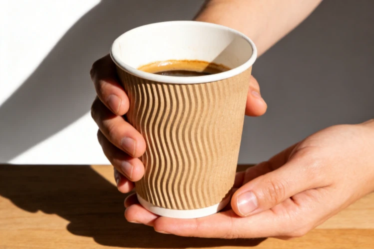
In my "20+ years of experience" at Amity Packaging, Jonh and I have seen firsthand how quickly trends move. It is not just clothes that change every season. Even something as seemingly simple as a disposable paper cup is caught in the whirlwind of "fast fashion aesthetics." Just as clothing brands follow the runway, beverage brands follow social media. They adapt their cup designs to reflect the latest "trending colors, fonts, and visual styles." Think of your cup not just as a container, but as a small, portable billboard. It shows off the current zeitgeist. This rapid evolution presents unique challenges and opportunities for us. We help our clients stay ahead. Let's explore how these humble corrugated cups have become miniature trendsetters, reflecting the dynamic world of design.
A Miniature Canvas for the Color Palette: How Do Corrugated Cups Capture and Embody Annual Color Trends?
Are you aware that the colors on your cup are often chosen to match the current year's fashion? There's a subtle art to it.
Corrugated cups efficiently capture and embody annual color trends by serving as "a miniature canvas for the color palette." Brands quickly integrate Pantone's 'Color of the Year' or seasonal fashion hues into cup designs. This allows them to signal modernity, align with consumer aspirations, and create an instantaneous, on-trend visual statement that is both accessible and transient.
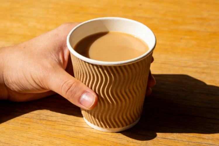
When Jonh and I discuss design with clients, color is always a major topic. He often says, "A new color can make an old product feel fresh." The question, "A Miniature Canvas for the Color Palette: How Do Corrugated Cups Capture and Embody Annual Color Trends?" perfectly describes this. Think of Pantone's "Color of the Year." Once announced, you see it everywhere: clothes, home decor, and, yes, even disposable cups. Corrugated cups are perfect "miniature canvases." They allow brands to quickly adopt these "annual color trends." This strategy is clever. Trending colors evoke specific emotions or cultural moods. When a brand uses a currently popular color on its cup, it instantly signals that it is modern. It is aware. It is relevant. This aligns the brand with the latest aesthetic. It makes the cup feel current, almost like a fashion accessory. Our team at Amity helps clients with "logo & printing customization." We ensure these trending colors are accurately and vibrantly reproduced. This ensures their cups look exactly on-point with what is popular right now.
The Psychology and Logistics of Rapid Color Adoption in Packaging
The concept of corrugated cups as "A Miniature Canvas for the Color Palette" goes beyond mere aesthetics. It's a strategic move by brands to embody "annual color trends" quickly. This process is driven by both design psychology and the practicalities of modern manufacturing.
1. Why Color Trends Matter in Fast Fashion Packaging:
Instantaneous Association: Specific colors are intrinsically linked to seasons, moods, and cultural movements. Adopting a trending color instantly positions a brand as desirable and current. A cup in the current "Color of the Year" signals fashion-forward thinking.
Emotional Resonance: Colors evoke powerful emotions. For example, a calming blue might resonate with a desire for tranquility. A vibrant yellow might suggest optimism. Brands leverage this to create a fleeting yet impactful emotional connection.
Perceived Newness: Even if the product inside remains the same, a change in cup color can give the impression of a fresh offering. This constant refresh keeps consumers engaged. "Our 'efficient production & delivery' is crucial here," I explain to clients. "We can turn around new color designs very quickly for seasonal campaigns."
2. The Logistics of Capturing Color Trends:
Pantone and Trend Forecasting: Design agencies and color authorities like Pantone annually forecast color trends. Brands watch these closely.
Digital Design and Printing: The widespread use of digital design tools and advanced printing technologies (which we utilize at Amity) allows for rapid iteration of color schemes. It's much faster than, say, changing a product's physical form.
Cost-Effectiveness on a Small Canvas: Changing the ink color for a cup run is a relatively inexpensive way to refresh a brand's image compared to, for example, redesigning a complex product. The "miniature canvas" of the cup makes this economically viable.
Market Responsiveness: Brands need to be agile. If a particular color suddenly gains traction on social media, they can quickly incorporate it to capitalize on the trend.
3. Amity's Role in Facilitating Color Trends:
Accurate Color Matching: Our "strict quality control" and advanced printing equipment ensure that the chosen trending colors are reproduced accurately and consistently across all cup batches.
Material Compatibility: We consult on how different paper materials and coatings (e.g., matte vs. gloss finishes) can influence the perception of color. A matte finish might make a pastel trend feel softer.
Design Consultation: We advise clients not just on printing but also on integrating new colors with existing brand guidelines, ensuring cohesion while staying trendy.
| Factor Influencing Color Trends | How it Manifests on Corrugated Cups | Brand Advantage Gained | Amity's Support for Brands |
|---|---|---|---|
| Trend Forecasts (e.g., Pantone) | Cups adopt latest "Color of the Year" quickly | Positions brand as modern, relevant | "Logo & printing customization," color accuracy |
| Pyschological Impact of Color | Emotional resonance with consumers based on hue | Creates fleeting emotional connection | Material consultation for optimal color display |
| Fast Production Needs | Rapid design-to-print cycles for seasonal themes | Ensures "perceived newness" constantly | "Efficient Production & Delivery" capabilities |
The strategic adoption of "annual color trends" on corrugated cups transforms them into effective "miniature canvases for the color palette." This not only keeps brands feeling fresh and relevant but also leverages the powerful psychological impact of color to engage consumers in the fast-paced world of design.
The Emotional Expression of Typography: How Do Cup Font Designs Evolve, from Retro Serif to Genderless Aesthetics?
Do you notice how the style of text on your cup subtly changes the entire feel of the brand? It speaks volumes.
The "emotional expression of typography" on corrugated cups evolves rapidly. Font designs move through trends, from "retro serif" revivals to the rise of "genderless aesthetics." This continuous stylistic iteration allows brands to communicate specific emotions, target demographics, and convey brand values such as nostalgia, sophistication, or inclusive modernity, without changing any imagery.
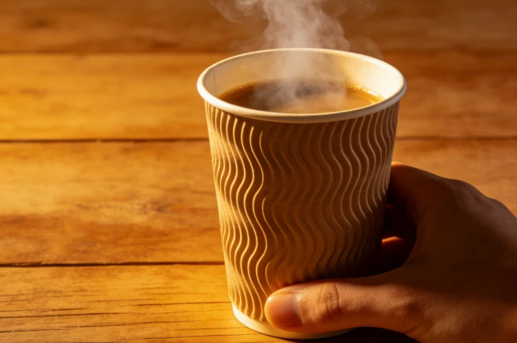
As an engineer by training, I appreciate precision. In design, typography is precision for emotion. Jonh often points out that "the font we use is as important as the logo itself." The question, "The Emotional Expression of Typography: How Do Cup Font Designs Evolve, from Retro Serif to Genderless Aesthetics?" speaks directly to this. Fonts are not just letters. They carry "emotional expression." A hefty "retro serif" font might evoke a sense of heritage or artisan quality. It makes you feel classic. A clean, minimalist sans-serif, often associated with "genderless aesthetics," might signal modernity, simplicity, and inclusivity. These stylistic iterations are very deliberate. They aim to connect with current cultural movements. We have seen a swing from ornate scripts to bold, blocky fonts, and now towards very clean, almost neutral typefaces. This allows brands to constantly update their image. They can target different age groups or lifestyles. My team at Amity works closely on "logo & printing customization." We ensure that these subtle textual shifts are printed perfectly. This helps the brand maintain its intended tone and feel.
Decoding the Language of Typefaces on a Compact Surface
The "emotional expression of typography" on corrugated cups is a sophisticated aspect of "fast fashion aesthetics." The rapid "stylistic iteration of cup font designs" reflects deeper cultural shifts. It allows brands to convey nuanced messages on a compact surface, spanning from "retro serif" nostalgia to cutting-edge "genderless aesthetics."
1. Typography as a Branding Tool:
Personality and Tone: Different typefaces convey distinct personalities. A strong, bold font might suggest confidence. A thin, elegant font might suggest luxury. This immediately sets a brand's tone.
Historical Context: Fonts are tied to historical periods. A well-chosen "retro serif" can instantly evoke nostalgia. This creates an emotional connection with consumers.
Readability and Impact: On a small, often moving product like a cup, font choice must balance aesthetic appeal with immediate readability and impact. Too complex, and the message is lost. Too simple and it lacks character.
2. Evolution of Font Trends on Cups:
Retro Revival: We've seen a surge in vintage-inspired fonts, particularly robust serifs or playful scripts from the mid-20th century. These tap into a desire for familiarity and authenticity.
Minimalism and "Genderless Aesthetics": A significant trend has been towards clean, unadorned sans-serif fonts. These are often characterized by uniform stroke weights and open counters. They communicate simplicity, modernity, openness, and inclusivity. This "genderless" style avoids traditional masculine or feminine associations.
Handwritten and Artisanal: Fonts that mimic human handwriting or artisanal lettering convey a sense of craft, uniqueness, and individuality. This contrasts with mass-produced feel.
3. Why This Evolution Matters for Amity:
Precision in Printing: The subtle differences between font weights, serifs, and kerning (spacing between letters) are crucial for the intended "emotional expression." Our "quality control" ensures these details are perfectly reproduced.
Material Interaction: The texture of the corrugated paper or the absorbency of the coating can affect how a font appears. We advise clients on material choices to ensure the typography looks its best. "A delicate script on a rough, recycled paper might not have the intended elegance unless we adjust the printing method," I sometimes tell Jonh.
Adaptability: Our "tailor-made solutions" allow brands to quickly switch between font styles. This ensures their packaging remains current with the latest "stylistic iteration" without high costs or long lead times.
| Typographical Trend | "Emotional Expression" Conveyed | Brand Message Delivered | Amity's Expertise for Clients |
|---|---|---|---|
| Retro Serif | Nostalgia, heritage, authenticity, craftsmanship | Establish tradition, premium quality | Fine detail printing for classic appeal |
| Genderless Aesthetics (Minimalist Sans-serif) | Modernity, inclusivity, simplicity, efficiency | Contemporary, accessible, forward-thinking | Clear, crisp lines on various materials |
| Handwritten/Artisanal | Uniqueness, personal touch, creativity, warmth | Boutique, indie, personalized | Custom print solutions for unique fonts |
The "emotional expression of typography" is a dynamic field, constantly evolving on the "miniature canvas" of the corrugated cup. By expertly navigating these "stylistic iterations," from "retro serif" to "genderless aesthetics," brands can accurately communicate their identity and values, making the cup a powerful, subtle communicator of brand personality.
Visual Sketching and Symbolic Play: How Are Minimalist Illustrations, Acid Graphics, and Y2K Styles Interpreted in a Compact Space?
Have you ever noticed how complex art trends get boiled down to a tiny drawing on your cup? It is an act of design compression.
"Visual sketching and symbolic play" condense complex art movements into compact cup designs. "Minimalist illustrations," abstract "acid graphics," and nostalgic "Y2K styles" are interpreted through simplified forms, limited color palettes, and iconic symbols. This allows brands to tap into subcultures and zeitgeists efficiently, making a bold yet understated statement within a "compact space."
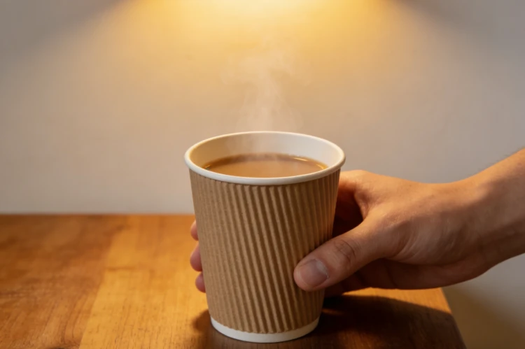
Designing for a small cup is like writing a very short story. Every detail must count. Jonh often says, "Our cups are often seen for just a few minutes. The design has to hit fast." The question, "Visual Sketching and Symbolic Play: How Are Minimalist Illustrations, Acid Graphics, and Y2K Styles Interpreted in a Compact Space?" highlights this challenge. Designers must distill complex art trends into impactful visual elements. "Minimalist illustrations," with their clean lines and limited details, are perfect for a cup. They convey a message quickly. "Acid graphics," with their psychedelic, flowing forms, need to be simplified but still retain their energetic vibe. And "Y2K styles," with their chunky pixels, gradient shifts, and early internet-era aesthetic, require careful selection of iconic symbols. This is "symbolic play." It involves using a few key elements to represent a whole movement. Our "custom dimensions, materials, printing, and structure" at Amity are all about making these "visual sketching" efforts come to life. We help brands ensure their chosen style is clear and impactful, even on a curved, "compact space."
The Art of Condensing Artistic Movements for Disposable Packaging
The concept of "Visual Sketching and Symbolic Play" on corrugated cups exemplifies how "fast fashion aesthetics" adapt. It demonstrates how designers interpret complex movements like "Minimalist Illustrations," "Acid Graphics," and "Y2K Styles" into effective visual communication within a "compact space." This requires immense skill and understanding of both design trends and packaging limitations.
1. Why Designers Employ "Visual Sketching" on Cups:
Immediate Recognition: On a rapidly consumed item, visuals must be instantly recognizable and evocative. Simplified forms achieve this better than intricate details.
Trend Saturation: As trends like Y2K or Acid Graphics become mainstream, brands need to incorporate them. This signals currency without overwhelming the viewer.
Printing Limitations: While our printing technology is advanced, complex gradients or extremely fine details can be challenging or costly to reproduce consistently on a corrugated surface. "Simple, bold lines often translate better and last longer, even after handling," I advise clients.
2. Interpretation of Specific Styles in a Compact Space:
Minimalist Illustrations: These flourish on cups. They use simple line art, limited color palettes, and ample white space. They convey sophistication, clarity, and often a focus on sustainability or craft. The simplicity makes them highly reproducible.
Acid Graphics: This style, known for its psychedelic, fluid, and often distorted forms, is adapted by using bold, swirling lines, vibrant but carefully chosen color combinations, and abstract patterns. The key is to capture the energetic feel without becoming messy.
Y2K Styles: To evoke the late '90s/early 2000s, designers use specific color schemes (metallics, pastels, bright neons), chunky block fonts (as discussed in typography), pixel art elements, and motifs like bubbles, gradients, or early digital interfaces. These are often used as small, iconic embellishments rather than full scenes.
3. The Role of "Symbolic Play":
This involves using a small, well-chosen icon, pattern, or color combination that acts as a shorthand for the entire aesthetic movement. It's like a visual wink to those in the know.
It leverages cultural literacy, assuming the audience understands the broader context that a specific pattern or color evokes.
4. Amity's Contribution to Visual Style Interpretation:
"Advanced Production Lines" and "Custom Dimensions": We ensure that even small, intricate details within these minimalist or stylized designs are accurately rendered on various cup sizes and shapes.
Material Texture Integration: The corrugated texture itself can add another layer to a design. For example, it might enhance the retro feel of a Y2K graphic.
Color Expertise: Our ability to achieve rich, consistent colors is critical for acid graphics and Y2K styles, where specific color combinations are key to the aesthetic.
| Art Movement Interpreted | "Visual Sketching" Technique on Cup | "Symbolic Play" Elements Used | Brand Impact Achieved |
|---|---|---|---|
| Minimalist Illustration | Clean lines, limited palette, negative space | Simple icons, abstract shapes | Sophisticated, modern, clear, focused |
| Acid Graphics | Bold, fluid lines, vibrant color blocks | Swirls, abstract patterns, distorted shapes | Energetic, edgy, counter-culture |
| Y2K Styles | Pixel art, gradients, specific color schemes | Bubbles, holograms, early digital icons | Nostalgic, playful, retro-futuristic |
The interpretation of complex art movements into "Visual Sketching and Symbolic Play" on corrugated cups showcases the dynamic nature of "fast fashion aesthetics." It allows brands to leverage trending designs within a "compact space," resonating with specific consumer groups and cultural moments.
The Driving Logic of Social Currency: How Does Corrugated Cup Design Cater to "Photo-Worthiness" and Instantaneous Aesthetics in the Influencer Economy?
Why do some cups end up all over social media? It is not by accident. It is a very deliberate design choice.
The "driving logic of social currency" dictates corrugated cup design. It caters directly to "photo-worthiness" and "instantaneous aesthetics" in the influencer economy. Designs are optimized for quick recognition, visual appeal in photos, and easy sharing on social platforms. This transforms the plain cup into a desirable prop, amplifying brand visibility and engagement through user-generated content.
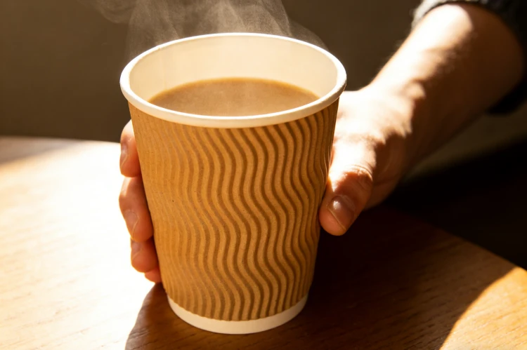
Jonh recently showed me a new cup design. He asked, "Do you think this will get shared?" That question is the heart of "The Driving Logic of Social Currency." In today's "influencer economy," a product's success is often measured by its "photo-worthiness." Our cups are no exception. Brands design cups not just for drinking, but for sharing. They want "instantaneous aesthetics." This means big, bold logos. Or quirky illustrations. Or unique textures. These designs stand out instantly in a social media feed. They are visually engaging for a quick scroll. The cup becomes a prop for content creators. When someone posts a stylish photo with a branded cup, it is free advertising. It builds "social currency" for the consumer who shared it by making them look on-trend. It also boosts the brand's visibility. At Amity, our "logo & printing customization" and "material & structure consultation" are geared towards this. We help clients create cups that are not just functional but are also ready for their close-up on Instagram, TikTok, or elsewhere.
Designing for the Digital Spotlight and User-Generated Content
"The Driving Logic of Social Currency" profoundly influences corrugated cup design. It directly addresses the need for "photo-worthiness" and "instantaneous aesthetics" within the pervasive "influencer economy." This modern approach elevates the cup from a mere container to a strategically designed piece of shareable content.
1. The Imperative of "Photo-Worthiness":
Visual Appeal: Designs must be visually striking and appealing when captured in a photograph or video. This often means clear lines, vibrant colors, interesting textures, or unique shapes that pop on screen.
Brand Recognition: The brand logo or distinctive design elements need to be easily identifiable, even in a quick glance or a busy social feed.
Aesthetic Integration: The cup must fit seamlessly into various aesthetic contexts (e.g., a minimalist desk setup, a bustling cafe, a vibrant outdoor scene). It should enhance the overall visual composition of the user-generated content.
2. Catering to "Instantaneous Aesthetics":
Quick Comprehension: In a scroll-heavy digital environment, designs need to convey their message or aesthetic instantly. Complex details can be lost.
Trend Alignment for Relevance: As discussed, aligning with current visual trends (colors, fonts, art styles) ensures the cup remains relevant and desirable for sharing.
"FOMO" (Fear of Missing Out): A beautifully designed, on-trend cup can trigger a desire in others to acquire the same item, leading to increased purchases and further sharing.
3. How This Fuels the "Influencer Economy":
User-Generated Content (UGC): "Photo-worthy" cups transform ordinary consumers into organic brand promoters. Every shared photo acts as a mini-advertisement.
Influencer Collaboration: Brands often send their products to influencers, knowing that an aesthetically pleasing cup will naturally feature in their lifestyle content.
Amplify Reach and Engagement: UGC and influencer posts dramatically increase brand visibility beyond traditional advertising channels, often with higher credibility.
Amity's Role in "Photo-Worthy" Design:
"Logo & Printing Customization": We ensure logos are sharp, colors are vibrant, and designs are intricate enough to look good on camera, even with close-ups.
"Material & Structure Consultation": We advise on custom finishes (e.g., matte for soft light, gloss for pop) and structural elements that add visual interest or a unique tactile experience.
"Tailor-Made Solutions": Our ability to produce unique shapes or sizes ensures brands can create truly distinctive cups that stand out in a crowded digital space. "We've even worked on textured patterns that catch the light beautifully for photos," I tell our design team.
| Digital Trend Driver | Design Element on Corrugated Cup | Impact on "Social Currency" | Amity's Design & Production Support |
|---|---|---|---|
| "Photo-Worthiness" (UGC) | Eye-catching colors, unique graphics, clear branding | Drives organic sharing, free advertising | High-fidelity "logo & printing," material quality |
| "Instantaneous Aesthetics" | Bold, current trends, clear visual message | Quick recognition, high engagement rates | Rapid implementation of "trending colors & fonts" |
| "Influencer Economy" | Designed as a lifestyle prop | Elevates brand status, builds aspirational image | "Tailor-Made Solutions" for unique designs |
The "driving logic of social currency" means corrugated cup design is now intrinsically linked to the "influencer economy." By prioritizing "photo-worthiness" and "instantaneous aesthetics," brands transform a functional item into a powerful marketing tool. They amplify their reach and engage consumers through the viral power of user-generated content.
Conclusion
Corrugated cup design is truly the "epitome of fast fashion aesthetics." It swiftly reflects "trending colors," "emotional expression of typography," and "visual sketching" of art styles on a "miniature canvas." This evolution is driven by the need for "photo-worthiness" and "social currency" in the powerful "influencer economy."


