

Who Dominates Your Visuals On The Cup Wall: Heat Transfer Or Flexographic Printing?
Leave a message
Who Dominates Your Visuals on the Cup Wall: Heat Transfer or Flexographic Printing?
Does your paper cup design truly stand out or does the printing process itself limit your vision? Balancing vibrant branding with functional integrity can be a challenge. How do you ensure your message shines through?
On a paper cup wall, both heat transfer properties (often from coatings) and flexographic printing techniques shape the final visual. Flexographic printing dominates by delivering crisp, full-color designs crucial for branding. However, material choices for heat transfer affect ink adherence and visual vibrancy. A well-designed cup harmonizes both elements for an impactful and functional product.
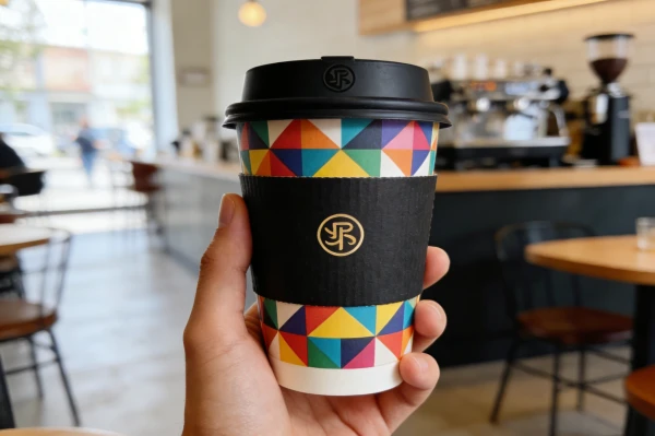
At Amity, Jonh and I have been "Mastering the Art of Disposable Paper Product Manufacturing" for "20+ years." We know that a cup is more than just a container; it is a canvas for your brand. Our "mission: Empower everyone who uses paper cups and bowls to truly understand paper packaging," means we explain these subtle battles. "From raw material selection to printing technology evaluation," we combine "tailor-made solutions" with "strict quality control." Let me explain how we ensure your visuals win the "Battle on the Cup Wall," making sure your brand messages are clear and vibrant, every time.
How Does Color Confrontation Compare in Reproduction Accuracy and Visual Impact?
Are your brand colors appearing dull or inconsistent on your paper cups, failing to capture the vibrancy of your vision? Poor color reproduction can dilute your brand message and impact perception.
Color confrontation in printing compares how accurately specified brand colors are reproduced and their overall visual impact on the paper cup. Flexographic printing offers excellent color fidelity and vibrancy with pantone matching, especially for large volumes. This ensures consistent brand representation and a strong visual impression, making your cup more appealing.
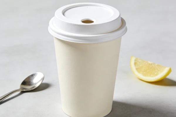
Many clients come to us with specific brand colors, and they expect those colors to look identical on every single cup. This is where "Color Confrontation: A Comparison of Reproduction Accuracy and Visual Impact" truly matters. Jonh, with his "15 years in disposable packaging manufacturing," constantly works to perfect our printing process. He knows that "creative yet practical logo design ideas" need equally creative and practical printing to come to life. I have seen clients disappointed when their vibrant logo looks muted. It is our job to get it right. Our "mass production & packaging" ensures that the colors from "tens of thousands of tons of pulp" are always consistent and true to your brand.
Unleashing the Full Spectrum of Your Brand on Paper Cups
The "Color Confrontation" between what is designed and what is actually printed often determines the success of a brand's visual identity on a paper cup. For us at Amity, ensuring "reproduction accuracy and visual impact" is a cornerstone of our service, blending precision with vivid expression. Jonh's deep comprehension of "printing technology evaluation" is central to this.
Flexographic Printing's Strength in Color Fidelity:
Mechanism: Flexography uses flexible relief plates and fast-drying inks transferred directly onto the paperboard. Each color uses a separate plate. This direct application means minimal color distortion or loss.
Reproduction Accuracy: We utilize Pantone Matching System (PMS) colors to ensure precise color fidelity. Our printing experts match your specified PMS codes with specific ink formulations. This means that if your brand uses a particular shade of blue, that exact shade is reproduced consistently across millions of cups. This accurate reproduction is crucial for brand recognition and maintaining a professional image, preventing "dull or inconsistent" appearances.
Visual Impact: Flexography delivers rich, opaque, and vibrant colors. The ink layers lay smoothly, creating a uniform and intense visual presence. This allows logos and graphics to pop, making the cup visually appealing and memorable.
Challenges and Solutions:
Material Interaction: The "paper-based food service products" we use have specific surfaces. Some coatings, such as PE or PLA, can affect ink absorption and final color appearance. Our experience ensures we select the right inks that adhere perfectly and display brilliantly on these "eco-friendly" materials.
Dot Gain and Registration: Achieving sharp images and accurate color overlays requires precise control over "dot gain" (how much ink spreads) and "registration" (aligning different color plates). Our "advanced production lines" and "strict quality control" procedures continuously monitor these factors to maintain crisp lines and perfect color separation. Jonh's team performs "full-process inspections" to spot any anomalies immediately.
Impact on Brand Storytelling:
Your paper cup is often the first, or only, physical interaction a customer has with your brand. Accurate and vibrant colors tell your brand story effectively. They evoke emotions, communicate quality, and foster brand loyalty. A visually stunning cup can significantly "enhance product performance and brand value."
For example, an ice cream brand relies on bright, cheerful colors to convey fun and freshness. If these colors are muted, the emotional connection with the consumer is weakened. We ensure the "artwork pops" and remains "consistent across large volumes," preventing any such dilution.
This meticulous approach to color reproduction ensures that your paper cups are not just containers, but powerful, consistent extensions of your brand's visual identity, truly dominating the "cup wall."
| Aspect | Flexographic Printing Advantages | Challenges & Solutions at Amity | Brand Visual Impact |
|---|---|---|---|
| Color Reproduction Accuracy | Precise Pantone Matching, consistent across runs | Ink formulation expertise, spectral density checks | High brand recognition, professional image |
| Vibrancy & Saturation | Rich, opaque, and intense colors with high visual appeal | Optimized ink adhesion to PE/PLA coatings | Strong emotional connection, product appeal |
| Detail & Clarity | Capable of sharp lines and fine print | Accurate plate creation, precise registration control | Crisp logos, legible text, clear messaging |
| Consistency Across Volumes | Reliable color output for "mass production" | "Strict quality Control," continuous monitoring | Uniform brand presence, builds trust |
Through focused attention on "Color Confrontation: A Comparison of Reproduction Accuracy and Visual Impact," we ensure that your brand's visuals are not just seen, but truly felt. This precision in printing empowers your brand to effectively convey its message every time.
How Does the Tactile Difference Create an Experience of a Smooth Surface vs. a Micro-Raised Texture?
Have you ever picked up a paper cup and felt something unexpected, either a perfectly smooth finish or a subtle texture? The surface feel impacts user perception and overall brand experience.
The "tactile difference" on a paper cup arises from the choice between a smooth surface (typical for standard coatings) and a micro-raised texture (often a result of specific printing techniques or specialty coatings). A smooth surface feels sleek and premium, while a micro-raised texture can add grip, an interesting sensory experience, or unique visual effects, directly impacting the user's perception of quality and the brand.
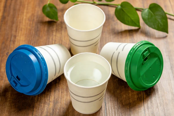
The "Tactile Difference: The Experience of a Smooth Surface vs. a Micro-Raised Texture" is something many people do not consciously notice, but it definitely impacts how they perceive a brand. Jonh and I believe that all senses contribute to a product's appeal. I remember one client who wanted their coffee cups to feel particularly "warm and inviting," so we explored textured varnishes for them. It is part of our commitment to "tailor-made solutions." This seemingly small detail enhances the "brand value" and the overall "drinking experience" of our "disposable paper cups."
Engineering the Sensory Experience of a Paper Cup
The "Tactile Difference" on a paper cup is a powerful, yet often subtle, element in the overall user experience. It transcends mere visual appeal, engaging another sense to deepen brand connection and elevate the perception of quality. For us at Amity, understanding this "micro-raised texture" versus "smooth surface" is part of our comprehensive "material & structure consultation."
The Smooth Surface Experience:
Characteristics: A smooth surface is typically achieved with standard PE (polyethylene) or "PLA bio-based" coatings. These coatings provide a uniform, low-friction finish.
Sensory Impact: It conveys a sense of cleanliness, sleekness, and professionalism. The cup feels cool and consistent to the touch. This smooth finish is generally associated with standard, high-quality "disposable paper cups" and "disposable paper bowls." It is unobtrusive and allows the visual design to take center stage without any tactile distractions.
Functional Benefits: Smooth surfaces are easier to clean (if a drop falls outside), and they often allow for crisper printing without any interference from texture. This is important when "logo & printing customization" demands precision.
The Micro-Raised Texture Experience:
Characteristics: Micro-raised textures can be created through different methods, such as specific ink layers (e.g., a thick varnish, often called a tactile finish or spot UV in other printing), embossing (though less common on disposable cups), or certain specialty paperboard types during "raw material selection."
Sensory Impact: This texture offers a unique haptic feedback. It can make the cup feel warmer, more organic, or more luxurious. For instance, a subtle linen-like texture might evoke naturalness, while a slightly rougher finish could suggest a hand-crafted quality. This "tactile difference" adds a layer of depth to the user's interaction with the cup. It makes the cup feel more substantial, which can be appealing for premium brands.
Functional Benefits: Certain textures can improve grip, especially for "hot & cold" beverages where condensation might form. The textured surface can also add visual depth, contrasting beautifully with smooth areas of the design. Jonh, with his "creative yet practical logo design ideas," has helped clients integrate these textures to enhance their branding. This is about delivering "solutions that enhance product performance and brand value."
Balancing Tactile and Visual:
The choice between a smooth or textured surface needs to align with the brand's identity and the product's purpose. A premium coffee brand might opt for a subtle texture to enhance the feel of warmth, while a vibrant juice brand might prefer a slick, smooth surface that highlights bright colors.
We help clients make these decisions through our "material & structure consultation." We consider the entire experience, ensuring that print integrity, insulative properties, and the desired tactile feel all work together harmoniously.
The deliberate engineering of the cup's surface finish is another way we go beyond mere manufacturing, focusing on delivering a holistic and memorable brand experience with every "disposable paper cup."
| Surface Characteristic | Sensory Experience | Brand Perception | Practical Implications | Amity's Customization Focus |
|---|---|---|---|---|
| Smooth Surface | Sleek, clean, cool to touch | Professional, modern, hygienic | Crisp printing, less friction, standard for many coatings | "PE/PLA coated" options, optimal for intricate prints |
| Micro-Raised Texture | Substantial, warm, unique tactile feedback | Premium, artisanal, natural, distinctive | Enhanced grip, visual depth, may affect print detail slightly | Specialty varnishes, specific paperboard choices, client consultation |
| Overall Comfort | Depends on desired feel, consistent across surface | Aligns with brand's sensory message | User satisfaction, repeat business | "Tailor-made solutions" to match brand identity & product use |
By understanding this "tactile difference," we empower clients to go beyond visuals, creating a multi-sensory "experience of a smooth surface vs. a micro-raised texture" that truly differentiates their brand.
What Are the Cost Considerations for Small-Batch Customization vs. Mass Production?
Are you struggling to get custom packaging because minimum order quantities are too high, or unit costs for small runs are astronomical? Balancing customization desires with budget realities is a common challenge.
"The Economics of Scale" dictates cost considerations for small-batch customization versus mass production. Small batches typically incur higher unit costs due to setup fees and less material efficiency. In contrast, "mass production" leverages economies of scale, significantly reducing per-unit costs through optimized material use, automated processes, and long production runs, making custom packaging more affordable at volume.
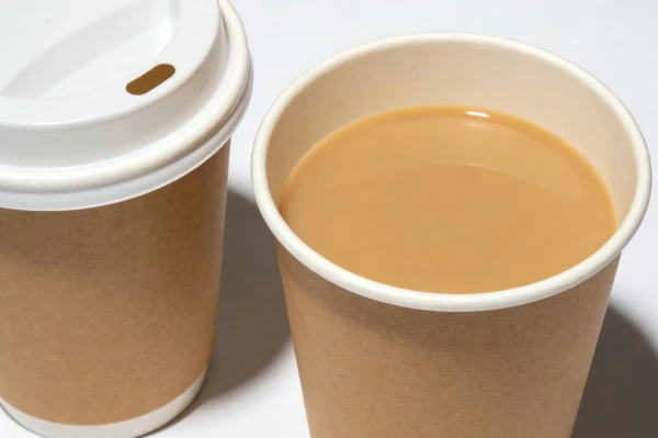
"The Economics of Scale: Cost Considerations for Small-Batch Customization vs. Mass Production" is a conversation Jonh and I have with clients constantly. My own journey, helping "many clients expand their businesses," has shown me that understanding costs is paramount. We strive to be "promoters and enablers" of the industry, and that means being transparent about how pricing works for "tailor-made solutions." While we offer flexibility, the reality of manufacturing means that volume brings efficiency. Jonh, focused on "reducing production costs," has optimized our "advanced production lines" to extract maximum value from every large order.
Navigating the Financial Realities of Packaging Production
"The Economics of Scale: Cost Considerations for Small-Batch Customization vs. Mass Production" is a fundamental principle in our industry. While Amity strives to offer versatile "tailor-made solutions," understanding the cost structures is crucial for clients to make informed decisions and optimize their budgets. This is how we allow clients to "achieve financial freedom while helping many clients expand their businesses."
Small-Batch Customization Costs:
Higher Unit Price: For smaller orders, the initial "setup fees" are spread across fewer units. These fees include design finalization, plate making for "flexographic printing," machine setup and calibration, and initial material preparation. These fixed costs are significant regardless of order size.
Material Inefficiency: Buying raw "pulp" or "FSC-certified materials" in smaller quantities often means higher per-unit prices from our suppliers. Waste from initial runs ("make-ready" waste to ensure color and registration accuracy) is also spread over fewer sellable units, increasing its impact.
Labor Costs: Even with automated lines, some manual oversight is needed for smaller, more customized runs, which also contributes to higher per-unit labor costs. Our lines might have to be reconfigured more frequently.
Flexibility and Niche Appeal: The advantage here is flexibility, quicker time to market for new products, and the ability to test designs without a massive upfront commitment. This is often crucial for "newcomers" or specialized product launches.
Mass Production Cost Savings:
Lower Unit Price: With "mass production," fixed setup costs are amortized over hundreds of thousands or even millions of units, dramatically reducing the per-unit cost.
Material Efficiency: We purchase "tens of thousands of tons of pulp" and other materials in bulk, securing lower prices. Cutting patterns are optimized for long runs, minimizing scrap. Our "optimizing production to reduce energy consumption and waste" is highly effective here.
Automated Efficiency: Our "fully automated production lines" run continuously for extended periods, maximizing output at peak efficiency with minimal human intervention. This drives down labor costs per unit.
Cost-Effectiveness at Scale: "Mass production" is the most cost-effective way to get "disposable paper cups" and "disposable paper bowls" to a broad market, providing the best value for money when high volumes are needed. Jonh's expertise in "improving quality and reducing production costs" truly shines in this area.
Client Guidance:
We advise clients to balance their budget with their volume needs. Sometimes, a slightly larger initial order can yield significant per-unit savings, making it more economical in the long run. We also explore options like periodic releases or staggered production to help manage cash flow while still benefiting from some scale.
This consultation is part of our "mission: Empower everyone who uses paper cups and bowls to truly understand paper packaging," allowing clients to make smart choices for their business growth and "strengthen their brands."
Understanding these economic realities allows our clients to plan their packaging strategy effectively, whether they are launching a niche product or scaling for a mass market.
| Cost Factor | Small-Batch Customization | Mass Production | Decision Making Implication | Amity's Strategy/Advantage |
|---|---|---|---|---|
| Fixed Setup Costs | Spread over few units, high per-unit impact | Amortized over many units, low per-unit impact | High impact on small orders, less on large orders | Transparent setup fees, optimized changeovers |
| Raw Material Procurement | Higher per-unit cost due to smaller buys | Lower per-unit cost due to bulk purchasing | Price sensitivity for smaller volumes | "20+ Years of Experience" in bulk sourcing, strong supplier relations |
| Production Efficiency | More machine changeovers, setup waste per batch | Long, uninterrupted runs, minimal waste | Significantly impacts overall cost and lead time | "Efficient Production & Delivery," automated lines |
| Labor Costs | Higher per-unit due to more oversight/setup | Lower per-unit due to high automation | Major cost driver for low volumes | Lean manufacturing, skilled technicians |
| Flexibility vs. Cost | High flexibility, high cost | Low flexibility (once started), low cost | Balance immediate needs with long-term economies | "Tailor-made solutions," project consultation |
By clearly outlining "the Economics of Scale: Cost Considerations for Small-Batch Customization vs. Mass Production," we help clients optimize their budgets. This ensures they choose the most efficient path for their "packaging project," whether for "newcomers" or "industry veterans."
What Are the Green Progress Differences in Water-based Inks and Energy Consumption?
Are you concerned about the environmental impact of your custom packaging, specifically regarding harmful inks and high energy use? Traditional printing methods can contribute significantly to a larger carbon footprint.
"The Green Progress" in paper cup manufacturing involves significant differences when comparing water-based inks and energy consumption. Water-based inks eliminate harmful VOC emissions, making them more eco-friendly than solvent-based alternatives. Energy consumption varies by curing methods and production line efficiency. Amity prioritizes both to ensure sustainable "eco-friendly" packaging.
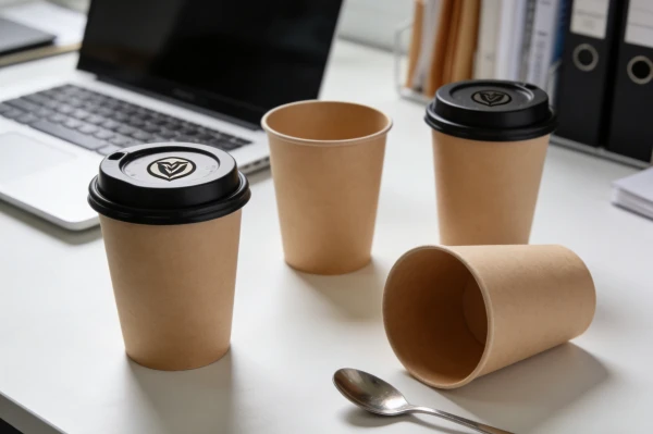
"The Green Progress: Water-based Inks Application and Energy Consumption Differences" is not just a trend for us; it is a core part of our identity and "sustainability commitment." We firmly believe that "business growth must align with environmental protection." Jonh has often spearheaded the adoption of "latest innovations in eco-friendly materials," including these advanced inks. I have personally seen the shift from older, more impactful methods to cleaner, more efficient ones on our factory floor. Our goal is to "deliver solutions that enhance product performance and brand value while caring for the planet."
Advancing Environmental Stewardship in Packaging Production
"The Green Progress" we champion at Amity involves continuous innovation to reduce our environmental footprint. The differences in "Water-based Inks Application and Energy Consumption" are two critical areas where we make significant strides, offering genuinely "eco-friendly" disposable paper products.
Water-based Inks Application:
Environmental Advantage: Traditionally, many printing inks contain Volatile Organic Compounds (VOCs), which evaporate into the atmosphere during the drying process, contributing to air pollution and posing health risks. "Water-based inks application" drastically reduces or eliminates these harmful VOC emissions. They use water as the primary solvent, making them much safer for the environment and for our production team.
Performance: Modern water-based inks perform exceptionally well, achieving vibrant colors and excellent print quality, even for complex "logo & printing customization." They adhere well to our "FSC-certified paper from responsibly managed forests" and "PLA bio-based" coatings. This aligns with our mission to produce high-quality products without compromise to the environment.
Safety: Using water-based inks means that our "disposable paper cups" and "disposable paper bowls" are printed with safer materials, a critical concern for "paper-based food service products." This enhances consumer safety and supports our "strict quality control" standards.
Energy Consumption Differences:
Production Line Optimization: Our "advanced production lines" are designed for "efficient production & delivery," including energy efficiency. We "optimizing production to reduce energy consumption and waste," using modern machinery that consumes less electricity per unit produced than older models.
Curing Methods: The type of ink chosen influences the "energy consumption differences." Water-based inks often require less intense curing or drying processes compared to some solvent-based or UV inks, which can demand high-energy UV lamps. Our processes are designed to be energy-lean while maintaining optimal drying times, contributing to "lower our carbon footprint."
Renewable Energy Integration: Beyond ink choice, our broader "sustainability commitment" includes exploring and integrating renewable energy sources where possible in our operations. Our goal is to minimize energy usage at every step, "Through every cup and bowl we produce, we promote a green, healthy, and sustainable lifestyle worldwide." Jonh stays updated with "latest innovations in eco-friendly materials, manufacturing processes, and equipment" to keep us at the forefront of this progress.
This commitment to green technology in both ink selection and energy management is integral to our identity. It allows us to offer products that are not only high-performing but also genuinely kind to the planet, aligning perfectly with our clients' "social responsibility."
| Environmental Aspect | Water-based Inks Advantage | Energy Consumption Differences (Amity) | Overall Green Progress | Direct Impact on Product/Brand |
|---|---|---|---|---|
| VOC Emissions | Significantly reduced or eliminated | Lower energy for drying/curing processes | Improved air quality, reduced chemical pollution | Safer for consumers, eco-friendly branding |
| Resource Depletion | Less reliance on petroleum-derived solvents | Optimized machinery, reduced overall energy use | Conservation of resources, reduced carbon footprint | Sustainability appeal, aligns with client values |
| Waste Generation | Easier cleanup, less hazardous waste | Minimal production waste (optimized processes) | Reduced landfill burden, responsible manufacturing | Eco-friendly product lifecycle, brand reputation |
| Product Safety | Non-toxic, food-safe applications | Efficient operations, "Eco-Driven Mindset" | Healthier products | Meets evolving regulations, builds consumer trust |
This "green progress" in both "water-based inks application and energy consumption differences" reflects our deep dedication to sustainability. It ensures that Amity's "disposable paper cups" and "paper bowls" are not just high-quality but also responsible choices for a healthier planet.
Conclusion
The visual identity of your paper cup is a battleground where design meets manufacturing reality. By understanding color fidelity, tactile experiences, cost economics, and sustainable practices, we ensure your brand dominates the cup wall, delivering both impact and integrity.


